Chapter 6 Are Different People Different?
Last week, we did a good part of the conceptual heavy lifting for this class. Well done! This week, we will refine the lessons that you have learned.
6.1 A Recap from Last Week
Why is inference so useful? The amazing thing about inference is that if you want to learn something about a population—for example their political ideology, how well a certain policy is working or any other characteristic you might want to know—you do not have to collect data on each individual in the population. It is enough to ask several hundred people and then estimate the value that is in the population.
This estimate comes at a price.
- We have to make sure that your sampling from the population is really random. Only if this assumption is fulfilled can we rely on the Central Limit Theorem to do Inference. In practice, this is often easier said then done.
- We can never be sure about the true value in the population. We have to communicate our uncertainty about our estimate of the population parameter. The 95% confidence interval is really useful for this: Given our assumptions hold, we indeed can make the statement that in 95 out of 100 cases the true population parameter is within these bounds.
6.2 What Are Bivariate Relationships?
We actually talked about bivariate relationships already. Two weeks ago, we wanted to understand the difference between your cohort and the cohort before you. We can think of this data also as a small data set with two variables. One variable encodes the effort that students put into their studies. The other variable would capture information about the cohort of the students. See? It is actually quite natural to think about data not only in the context of one single variable, but actually considering at least two variables at a time.
When we analyse data, we study the association between variables. A variable is a “characteristic that can vary in value among subjects in a sample or population” (Agresti 2018). Some typical examples area age, income, gender, education level, race, inequality in a country etc..
We express association formally as a connection between two variables and can use an arrow for that.
\[X \rightarrow Y \]
- The variable Y is called the dependent variable, or response variable.
- The variable X is called the independent variable, or explanatory variable.
For a bivariate analysis, we can measure the values of the variable in question and study “associations” between two or more variables. We first describe this relationship in our sample. We can then of course also do inference and test whether changes in the value of one variable \(X\) are associated with changes in the value of the other variable \(Y\) in the population at large.
Interpreting their relationship allows to make a statement about whether a change in one variable \(X\) is associated with changes of patterns of variable \(Y\).
6.3 Categorical Data
If we want to measure the association between two variables, we need to distinguish whether we have categorical data or continuous data. Let us begin with a closer look at categorical data.
6.3.1 Describing the Sample
Once we have collected our sample, we want to describe the data that is in the sample. This description is a first valuable step in our analysis of the data. Let us begin with a closer look at categorical data.
6.3.1.1 A First View
As long as the number of categories is small enough, we can use a cross tabulation. We can do this either with absolute numbers, or calculate proportions.
We could for example take a look at the relationship between the number of siblings you have and the amount of sleep you are usually getting per night.
|
|
Here, there is apparently not really a clear pattern: siblings is quite unrelated to sleep. We can of course also calculate percentages. If you are eager to understand how siblings affect the amount of sleep, it might make sense to calculate percentages that add up to 100% in each column. You can calculate cross tabulations independent of whether the data is nominal or any kind of ordinal data.
6.3.1.2 Measures for the Strength of the Association Between Variables
Measures that express the association between two variables are typically bound between \(-1\) and \(1\). By convention, they express how strongly related the variables are. You can find an overview in the following table.
| Association Measure | Interpretation |
|---|---|
| -1 | Perfect Negative |
| [-0.99, -0.71] | Strong Negative |
| [-0.7, -0.31] | Moderate Negative |
| [-0.3, -0.01] | Weak Negative |
| 0 | No Association |
| [0.3, 0.01] | Weak Positive |
| [0.7, 0.31] | Moderate Positive |
| [0.99, 0.71] | Strong Positive |
| 1 | Perfect Positive |
A positive association means that if the variable \(X\) grows, then the variable \(Y\) grows as well. In contrast, if the association is negative, then a growth in one variable means a reduction in the other.
For example, drinking beer and being thirsty is a negative relationship: the more beer you drink, the less thirsty you are. However, the relationship between a headache the next day and drinking beer is a positive one: the more beer you drink, the larger the headache the next morning.
6.3.1.3 Measuring the Strength of the Association Between Variables
Let us begin with nominal variables. As soon as at least one nominal variable is involved in the analysis, we use a measure that is called Cramér’s V. It will return the degree of association between variables. Since nominal variables cannot be ordered, the measures of these associations do not offer any insight about the direction of the relationship. It is therefore bound between \([0,1]\). How can you interpret this measure? The closer the measure to \(1\), the stronger the association between the two variables; the closer the measure to \(0\), the weaker the association between the two variables.
Another example: Do coffee drinkers have anything to do with how much you love summer? This is how the data looks like for the cohorts in 2018, 2019 and you.
|
|
|
We can calulate Cramér’s V between the preference of the morning drink and the love of summer for all cohorts on which there is data now.
- Cohort 2018: 0.47
- Cohort 2019: 0.34
- Cohort 2021: 0.43
- Cohort 2022: 0.23
- Cohort 2023: 0.49
Here, the quick analysis tells us that there is a moderate relationship at play. It is strongest for the cohort in 2023: It looks as if it were driven by summer loving coffee drinkers vs. tea drinkers who seem to prefer other seasons. In the 2022 cohort there is the weakest relationship among the four.
Whenever we are measuring the association between two ordinal variables, we want to choose something different. After all, now that the variables can both be ordered, we are able to make a statement about the direction of the association between them. The measure of choice is called Goodman and Kruskall’s gamma. Again, we will treat the exact way it works as a black box for this module. Suffice it to say that it ranges from \(-1\) to \(1\).
We revisit the example on the number of siblings and how much you sleep. We also add data from the other cohorts.
|
|
|
Again, we are eager to understand the strength of the relationship. This time, we use Goodman and Kruskall’s gamma.
- Cohort 2018: -0.44
- Cohort 2019: -0.22
- Cohort 2021: -0.64
- Cohort 2022: -0.14
- Cohort 2023: -0.16
Overall, the relationship turns out to be negative in all cases. Interesting! It is weakly negative for the cohort in 2019, 2022 and 2023, and moderately negative for the cohort 2018. For the cohort 2021, it even shows an almost strong negative relationship. Looking at the data from this cohort we can immediately see why: Single childs never sleep less than 8 hours and those with one sibling never less than 7 in that particular cohort.
6.3.2 Estimating the Parameters in the Population
We investigated the strength of the association between variables. Now, let us take a look and study how this plays out in the population. How certain can we be that there is actually a systematical relationship between the variables in the population? For any kind of categorical data—be it ordered or not—we will use a statistical test that is called the \(\chi ^2\)-Test (Chi-Squared Test). The way we will use it is very similar to the t-test we met two weeks ago. We first formulate the 0-hypothesis that there is actually no relationship in the data. Then, we take a look at our data. If there were really no relationship in the variables, how likely would it be that we observe the data that we have?
The \(\chi ^2\)-test is doing the following. The two cross tabulated variables result in a matrix with counts. The test looks up how many observations it would expect in each cell of the matrix if a sample of our size were collected, given there was no relation between the two variables. It then compares these values with the data we actually collected and calculates one single statistic—i.e. one single value—from it. This test statistic has a distribution, the \(\chi ^2\) distribution, which means that the test can make a probability statement: Given that the data were random, how likely is it to observe our data? Think of the value for the test statistic as our z-scores from last week. Given a z-score, how likely is it to observe a z-score that is larger on a Normal distribution?
If the data we observe is likely, then we will stick to the 0-hypothesis. If our sample were quite unlikely, we instead refute the 0-hypothesis. We would rather believe in the alternative hypothesis.
Let us implement a \(\chi ^2\)-test for our data to see the results and also learn how to interpret the results. We begin with the data for 2018. As you can see, the p-value value is at 0.40. Assuming there is no relation in the data, there is an almost 40% probability to observe the data that we do. This is still quite likely which is why we we will stick to the 0-hypothesis: it is quite likely to observe a sample like ours if both variables are not related.
##
##  Pearson's Chi-squared test
##
## data:  dat18$siblings and dat18$sleep
## X-squared = 26.208, df = 25, p-value = 0.3965
The data for 2019 looks fairly similar. Now, there is only a 28% probability that we would observe this data if we believe there is no relationship between the variables. However, this is still fairly likely, so again we stick with the 0-hypothesis.
##
##  Pearson's Chi-squared test
##
## data:  dat19$siblings and dat19$sleep
## X-squared = 28.742, df = 25, p-value = 0.2748
We take a look at the 2021 data. Here, we have a p-value of 0.02. The \(\chi ^2\)-test is telling us that it is really unlikely to observe their data assuming that these two variables are not related. We will refute the 0-hypothesis and will go with the alternative hypothesis. We believe that the two variables are related—of course in their sample, but also in the larger population of their cohort.
##
##  Pearson's Chi-squared test
##
## data:  dat21$siblings and dat21$sleep
## X-squared = 15.5, df = 6, p-value = 0.0167
And for completion, here are the years 2022 and 2023:
##
##  Pearson's Chi-squared test
##
## data:  dat22$siblings and dat22$sleep
## X-squared = 11.822, df = 12, p-value = 0.46
##
## Pearson's Chi-squared test
##
## data: dat$siblings and dat$sleep
## X-squared = 12.014, df = 16, p-value = 0.743Summing up, how do we interpret the results from both tests, the Goodman Kruskall gamma and the \(\chi^2\)-test? Remember that the first test was about the substantive relationship between the variables in your sample. We then tested with the \(\chi^2\)-test whether we believe that the relationship also exists in the respective cohort at large.
We are observing a negatively relationship—with differently strong relationships—for all data sets. The second test on statistical significance now offers insights about the population behind it. We want to know whether the data that we are observing in the sample is also likely to occur in the population. We have seen that for the cohorts in 2018, 2019, 2022 and 2023 it is still quite likely to observe the data even if the two variables are not related. But the statistical signal was not clear enough to really believe that it would also happen in the larger population.
The case is different for the 2021 cohort. Again we find a negative relation in the sample, but in addition the signal is so clear that we also believe that this relation should exist in the overall cohort. We refute the null hypothesis, and rather believe in the alternative hypothesis: There is a negative relationship between the two variables in the overall cohort. And the most likely strength is the one we calculate—which is the one we will ultimately believe in.
Let us sum up results in a table
| Which Cohort | Relation Between Variables in Sample | Relation Between Variables in Population (Cohort) |
|---|---|---|
| 2018 Data | Negative | None |
| 2019 Data | Negative | None |
| 2021 Data | Negative | Negative |
| 2022 Data | Negative | None |
| 2023 Data | Negative | None |
6.4 Continuous Data
You have learned how to do this kind of analysis for discrete data. Now let us have fun with continuous data. Again, we first take a closer look at how to describe the strength of the association between two variables. We will then proceed to understand what we can do to see whether this relationship also exists in the population at large.
6.4.1 Describe
We will distinguish between two different cases. What can you do when you have continuous data in one variable and discrete data in the other? We actually already did this kind of analysis, but now we can understand how this all fits together in a more systematic way.
You will end up with as many continuous variables as you have in your discrete variable. To compare the continuous data for these different groups you simply report a typical value for each group. You could pick the median or the mean—it is up to you. Here is an example from your data:
How long is your commute to university? It turns out, it takes the men in the class on average 17 mins. The women, however, take 16.89 mins. This looks like a bit of a difference.
To measure the association between two continuous variables we will correlate them. Ultimately we want to tell how much two variables are jointly different from their respective means. Imagine you have a subject in your data with two data entries. You observe that the person is an outlier on one variable \(X\). Is this person also an outlier on the other variable \(Y\) you recorded about her? If so, our measure should be high. We will get to our measure, the Pearson correlation coefficient \(r\), in two steps.
The first thing we have to calculate is the covariance. To what extent do two variables co-vary? The covariance is the statistical summary of the linear association between two interval variables. It measures the variation shared by values in two variables \(X\) and \(Y\).
\[ cov_{XY} = \frac{\sum(y_i - \bar{y})(x_i - \bar{x})}{n-1} \]
This clearly reminds you of the variance we calculated in week 2, right? It is basically the same formula, but this time, instead of squaring the product terms, we are taking the product of each the difference from the mean of variable in the numerator. But we cannot compare the covariance to other variables, since it depends on the scale of each specific variable. Ideally we could standardise it to measure on a common scale. To do so we divide the covariance with the standard deviations to get to the correlation.
\[ r = \frac{\text{covariance of x and y}}{\text{(standard deviation of x)(standard deviation of y)}}\]
The maths looks a bit scary—but only at first sight. You have seen all necessary building blocks already. We are just sticking them together here.
\[ r = \frac{cov_{XY}}{s_x s_y} = \frac{\frac{\sum(y_i - \bar{y})(x_i - \bar{x})}{n-1}}{\sqrt{\frac{\sum (y_i-\bar{y})^2}{n-1}*\frac{\sum (x_i-\bar{x})^2}{n-1}}} \]
The resulting Pearson’s r measures the strength of the association between two variables still between [-1, 1]. In 6.1 you can see how it would look like for the ideal cases: on the left r = -1, in the middle r = 0 and on the right r = 1.
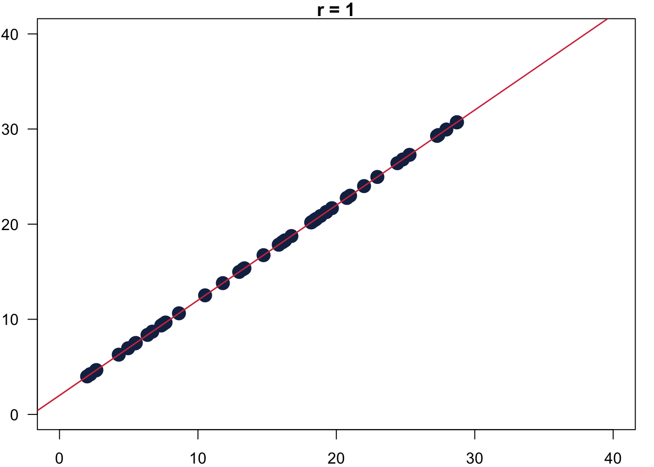
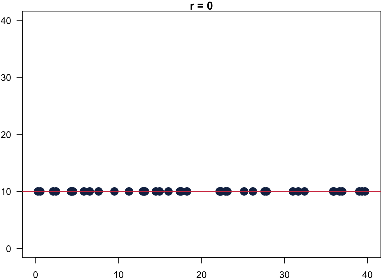
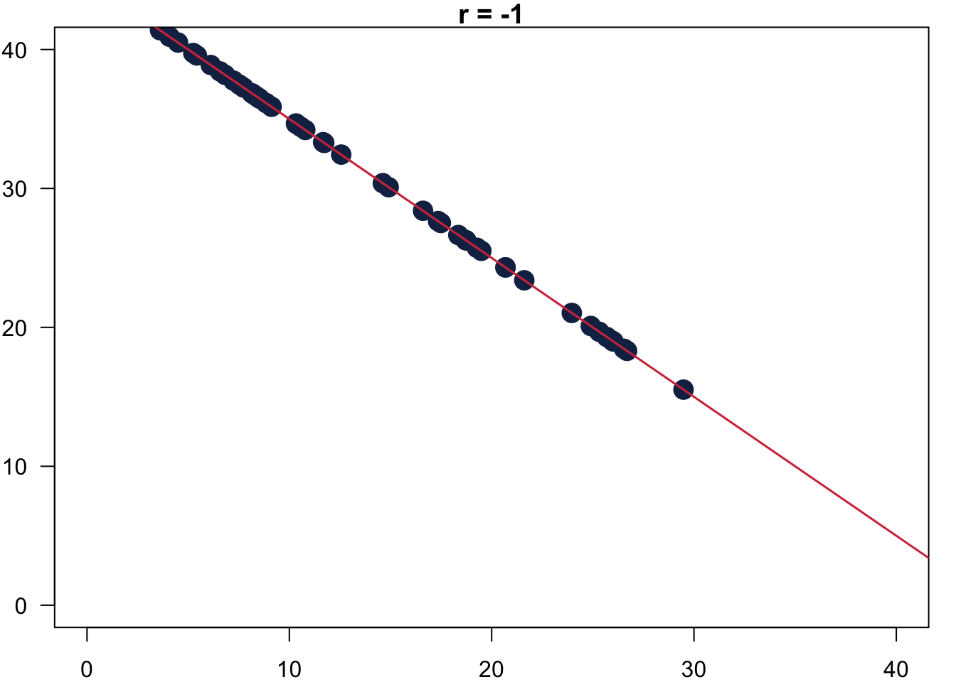
Figure 6.1: Values for Pearson’s r.
A quick example where we calculate Pearson’s correlation coefficient for data from our survey.
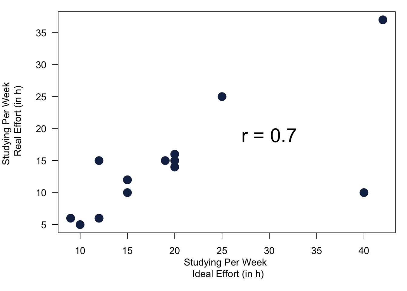
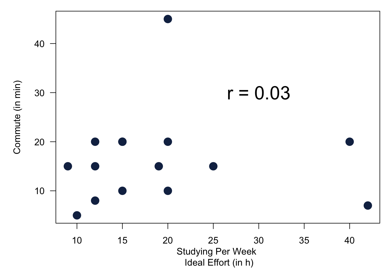
Figure 6.2: Values for Pearson’s r Using Our Survey.
It does make sense that the two study variables are ‘connected’. But what is the exact mechanism that connects them? Well that depends on the theory, or in other words, why we believe they are connected. The most convincing story to tell is that there is probably a general attitude towards university studies. It affects the effort for your studies and also drives the effort you think you should be putting into your secondary education.
Note that the correlation between the two variables does not provide you an answer for the reason why an association between variables exists. It is the task of your theory to tell a convincing story. As such, correlation between variables does not proof of the validity of any causal claim. But it is an observable implication of a theory and therefore a good hint that your reasoning is correct.
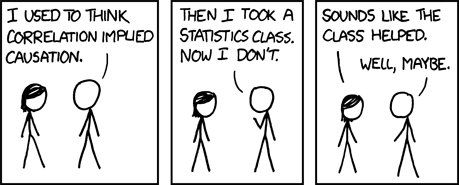
Figure 6.3: Source: https://xkcd.com/552/
6.4.2 Measures About the Population
Last bit for today. We measured the association between continuous variables and other continuous or categorical variables in the sample. But we still want to make statements about their relationship in the population. Is the evidence that we are observing in our sample strong enough to be able to make a claim about what is going on in the general population?
Let us first take a look at a combination of categorical variables and continuous data. We already covered this test two weeks ago when we spoke about t-tests. Let us use it to analyse whether it is likely that there is a difference in the time it takes to commute between men and women—not only between the students in 2021 in this module, but in their cohort overall. This is what the t-test is telling us.
##
##  Welch Two Sample t-test
##
## data:  dat21$commute by dat21$gender
## t = -1.838, df = 7.8991, p-value = 0.1038
## alternative hypothesis: true difference in means between group Female and group Male is not equal to 0
## 95 percent confidence interval:
##  -23.138267   2.638267
## sample estimates:
## mean in group Female   mean in group Male
##                 8.75                19.00
To interpret the results from this test, I will do a quick video this time.
We also studied the relationship between continuous variables. First between the two study variables. In addition, we also took a look at the study variable and the commute variable. This time, the statistical test is the correlation test. Without going into detail, its interpretation is very similar to what we have seen in the t-test. Again, take a quick look at the video to see how to interpret these results for the 2023 cohort.
##
##  Pearson's product-moment correlation
##
## data:  dat21$studyperweek and dat21$studyideal
## t = 4.338, df = 14, p-value = 0.0006815
## alternative hypothesis: true correlation is not equal to 0
## 95 percent confidence interval:
##  0.4187034 0.9109895
## sample estimates:
##       cor
## 0.7572408
##
## Pearson's product-moment correlation
##
## data: dat21$studyideal and dat21$commute
## t = 1.3255, df = 14, p-value = 0.2062
## alternative hypothesis: true correlation is not equal to 0
## 95 percent confidence interval:
## -0.1938747 0.7118046
## sample estimates:
## cor
## 0.33392226.5 Code
This week is again very light on code. R is a statistical software, so all the things that you have been learning today are really straightforward. All R code is in the verbatim font and lightly shaded like so: This is R code
| Combination of Variables | Describing Association in Sample | Testing for Association in Population |
|---|---|---|
| At least 1 nominal variable | Cramér’s V | \(\chi^2\)- test |
CramerV(var1, var2) |
chisq.test(var1, var2) |
|
| 2 ordinal variables | Goodman Kruskal’s Gamma | \(\chi^2\)-test |
GoodmanKruskalGamma(var1, var2) |
chisq.test(var1, var2) |
|
| 1 categorical and 1 continuous variable | Difference in Means | t-Test: |
mean(group1) - mean(group2) |
t.test(continuousvar ~ categoricalvar) |
|
| 2 continuous variables | Pearson’s r | Correlation Test |
cor(var1, var2) |
cor.test(var1, var2) |
6.6 Reading for This Week
The reading for this week is chapter 10 in Fogarty (2019).